Newsletter Subscribe
Enter your email address below and subscribe to our newsletter
Enter your email address below and subscribe to our newsletter


Elevate Your Space, Everyday.
 ByMaya Lin
Elevate your living room center. Learn how to style a coffee table using the 'Rule of Three' and balancing heights.
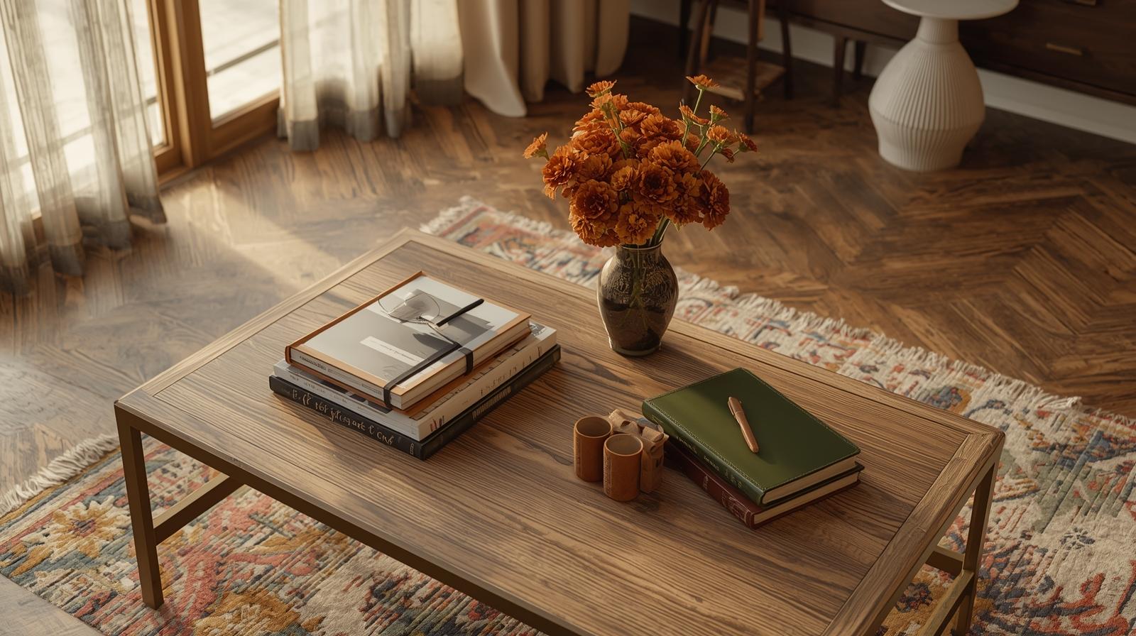
The rough grain of oak beneath your fingertips, the faint rustle of linen pages from a well-loved book, the soft glint of morning light catching a ceramic vase—your coffee table isn’t just furniture. It’s a quiet stage where daily rituals unfold and moods are set. When styled with care, it becomes the emotional anchor of your living room, whispering balance, warmth, and intention.
Odd numbers settle the eye. Not because rules demand it—but because they echo how nature arranges itself. A single stem in a vase. Three stones stacked by a creek. Five petals on a wild rose. There’s rhythm in asymmetry.
Even numbers pair off, creating symmetry that can feel static—like everything’s been accounted for, leaving no room for breath. Three objects invite movement. Your gaze travels between them, finding connection without confinement. It’s not rigid. It’s alive.
Negative space isn’t empty. It’s the pause between notes. The silence that lets you hear the melody. With only three elements, the surface stays open—uncluttered but not barren. You still have room for your morning mug, a friend’s wine glass, or a child’s crayon drawing left behind.
I keep a low, handmade stoneware tray near the center of my own table. On it: a beeswax taper in a blackened iron holder, two slim art books turned spine-in, and a tiny bronze casting of a sleeping fox I found at a flea market in Kyoto. That’s it. No more. No less. The tray holds them, but doesn’t dominate. The arrangement feels like a sentence—complete, but not overstated.
Three is enough to tell a story. Four starts to explain it.
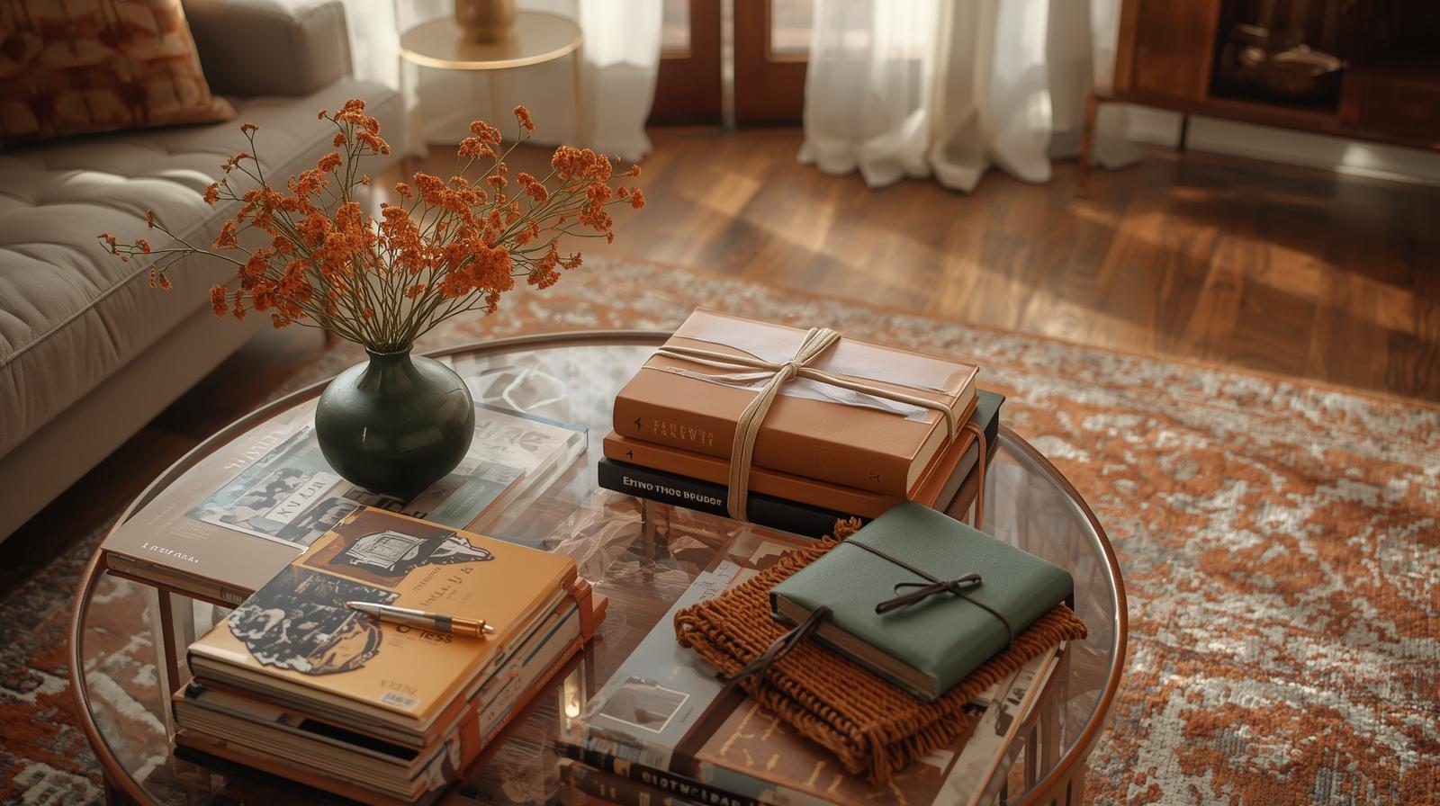
Before you place a single object, consider what lies beneath. The base layer sets the tone—not just visually, but emotionally. Is it warm? Cool? Absorbent? Reflective? This is where texture speaks loudest.
Sometimes the table itself is enough—especially if it’s oak or walnut with visible grain that catches afternoon sun. Other times, a linen runner or a shallow rattan tray adds softness. I prefer trays with slightly raised edges. They corral without corralling too much. (And they make dusting easier—a practical grace.)
Rattan whispers. Marble shouts. Matte ceramic hums. Choose what matches your room’s voice. In a space full of hard lines and cool surfaces, a nubby wool square or a hand-coiled clay dish softens the whole composition. In a cozy, dimly lit nook, a smooth river stone tray might catch just enough light to feel like a quiet beacon.
Remember: glossy surfaces under harsh overheads create glare—not atmosphere. If your lighting leans clinical (a common misstep we’ve all made), lean into matte or fibrous bases that soak up light rather than bounce it back. See our guide on living room lighting mistakes for more on how light sculpts mood as much as any object.
Verticality lifts the arrangement off the horizontal plane. It gives your eye a place to rest above the surface—like a tree rising from soil.
A single dried pampas plume in a short ceramic vase. A slender branch of foraged dogwood. Even an empty glass tube standing alone. These aren’t about blooms—they’re about line, shadow, and the suggestion of something growing, even in stillness. I often use stems that have gone to seed. Their fragility feels honest.
Without height, the table feels flat—literally and emotionally. A tall element creates a gentle focal point that balances the weight of books or bowls below. It doesn’t need to be dramatic. Just present.
If you’re drawn to fresh stems, keep them minimal. One type. One season. Wild carrot in summer. Eucalyptus in winter. Our flower arrangement basics guide walks you through choosing stems that feel gathered, not arranged.
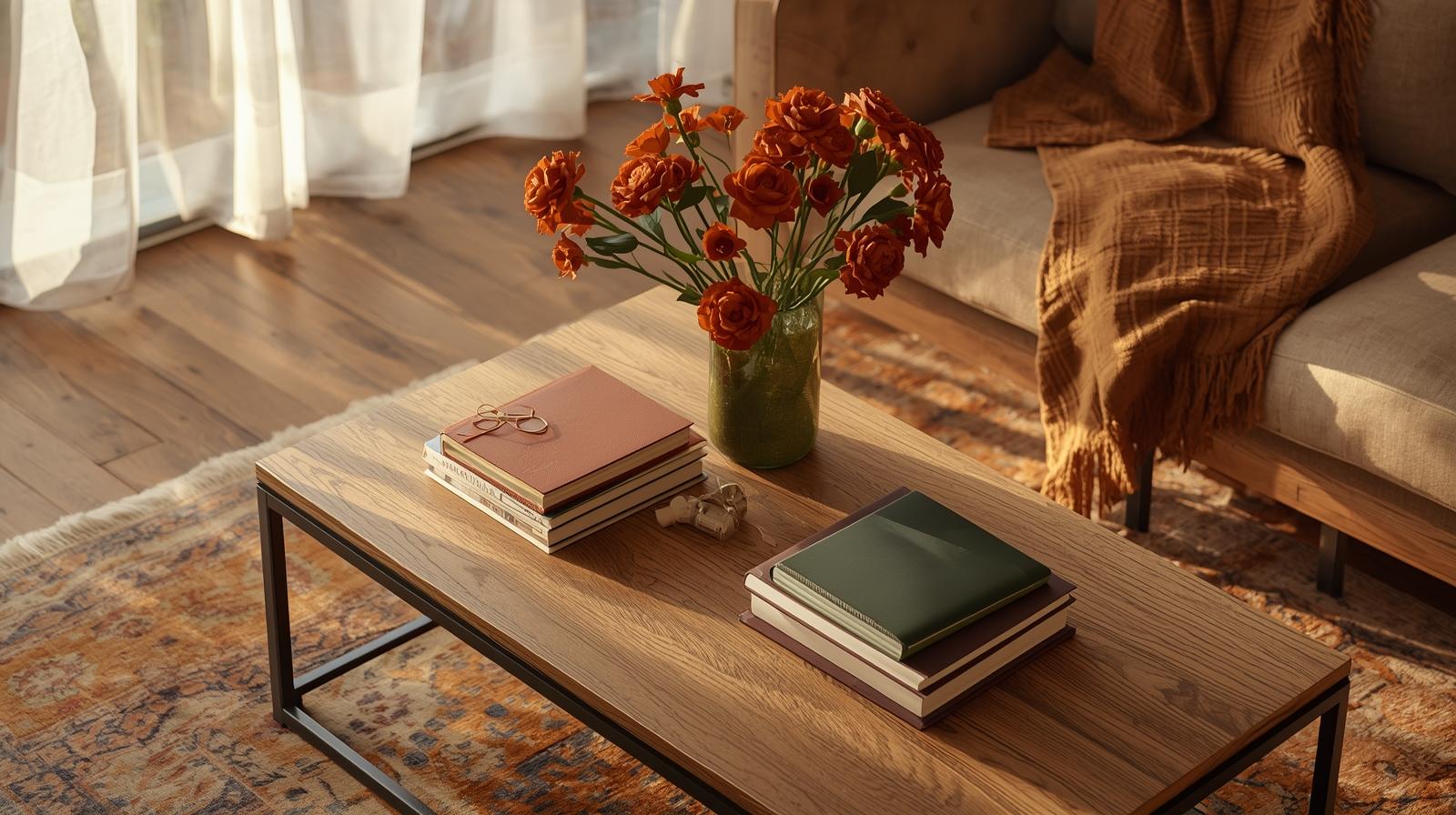
Books are never just books. They’re time capsules. Travel souvenirs. Conversations waiting to happen.
Pick ones that mattered to you. The novel you read on a train through Portugal. The architecture monograph that changed how you see windows. Even if no one opens them, their presence says: this room knows you.
Stack two or three. Place the largest at the bottom. Let spines face out—or turn them inward for a cleaner line. Mix cloth covers with paperbacks. A faded blue spine next to a mustard cloth binding? That’s color harmony you can’t fake with paint chips.
Not sure where to start? Our piece on books as decor offers ways to build stacks that feel personal, not performative.
This is where personality slips in. The quiet surprise.
I keep a tiny ceramic dish from Oaxaca that holds nothing but air. Next to it, sometimes, a pinecone from last fall. These objects don’t “match.” They coexist. And that’s the point.
Perfection feels sterile. A slight irregularity—an off-center knot in wood, a glaze drip on pottery—invites closer looking. It says: a human made this. A human chose this.
In spring, maybe it’s a nest of moss. In deep winter, a smooth piece of obsidian. Let this third object shift with your inner weather. It costs nothing to swap it out. But it changes everything.
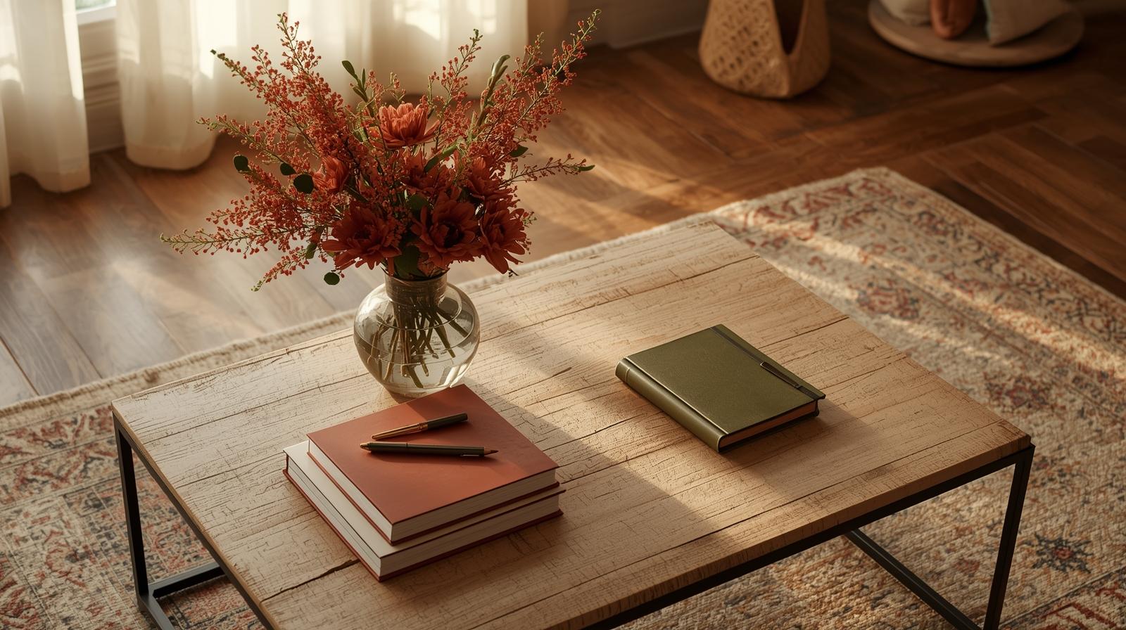
Light doesn’t just illuminate—it transforms.
Candlelight wraps around objects, softening edges and deepening shadows. Overhead LEDs flatten them. If you must use ceiling lights, dim them. Or better yet, rely on floor lamps that graze the table from the side. The goal is to see the texture of your linen book cover, not just its shape.
Glossy lacquer or mirrored trays? They double everything—including the chaos you’re trying to calm. Stick to materials that absorb light: unglazed clay, raw wood, heavy cotton. They don’t reflect. They receive.
Even the most soulful trio can look dull under the wrong light. Revisit our guide on lighting mistakes—it might be the missing piece.
This isn’t a museum display. It’s a surface for life.
Use coasters that nest under the tray or vanish into the wood tone. Choose a tray light enough to lift with one hand when guests arrive. Your arrangement should accommodate, not obstruct.
If the table starts feeling busy, take something away. Not rearrange. Remove. Often, the coffee rings and dog-eared pages are enough “decoration” for the day. That’s okay.
As days shorten, I swap the dried grasses for a small beeswax candle. In high summer, the stone dish holds a few sea glass shards. One change. That’s all it takes to realign with the season.
Styling isn’t about getting it right. It’s about paying attention.
You don’t need a design degree. You need presence. Notice how the morning light hits the vase. Feel the weight of the book in your hands before you place it. This is where beauty grows—not in rules, but in noticing.
A wooden bowl should feel warm. A linen cover should soften with use. A ceramic vase should carry the memory of its maker’s thumbprint. If it doesn’t invite touch, it might not belong here.
It sits quietly in the center of your life. Holding space. Holding stories. Holding the simple, sacred act of being at home.