Newsletter Subscribe
Enter your email address below and subscribe to our newsletter
Enter your email address below and subscribe to our newsletter


Elevate Your Space, Everyday.
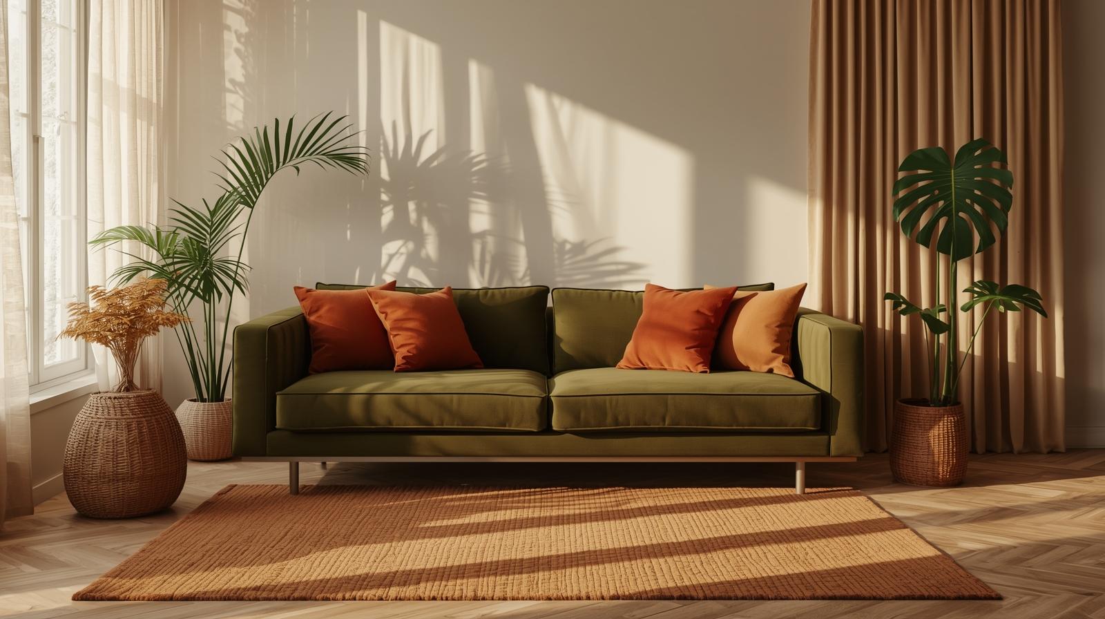
Discover the top Warm Minimalism trends for 2025. Learn how to blend cozy textures with clean lines to elevate your space.
The paint was still wet when the contractor handed me the sample board—ten swatches of beige, all claiming to be “warm,” none daring to whisper a single unnecessary note. In that quiet moment, I realized 2025’s interiors weren’t chasing trends; they were distilling decades of noise into silence, light, and intention. This is warm minimalism: not less, but better.
For years, interiors leaned hard into the clinical allure of pure white walls, polished concrete, and chrome finishes that reflected everything except warmth. It felt less like living and more like waiting in a very expensive airport lounge. That era is quietly receding.
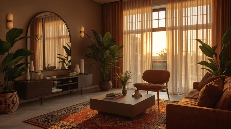
Now, walls are tinted with whispers of clay, mushroom, or sun-baked sand. These aren’t colors that shout. They absorb daylight gently, shifting from pale ochre in the morning to a soft taupe by dusk. The psychology is subtle but significant: grounded tones lower visual tension. They make a room feel held, not exposed. (If you’ve been scrolling through our calm-color-palettes guide, you’ll recognize this shift—it’s not just aesthetic, it’s physiological.)
Minimalism once meant absence. Now it means presence—of texture, of quietude, of materials that age with dignity. There’s a difference between empty and intentional. One feels abandoned. The other feels curated with care.
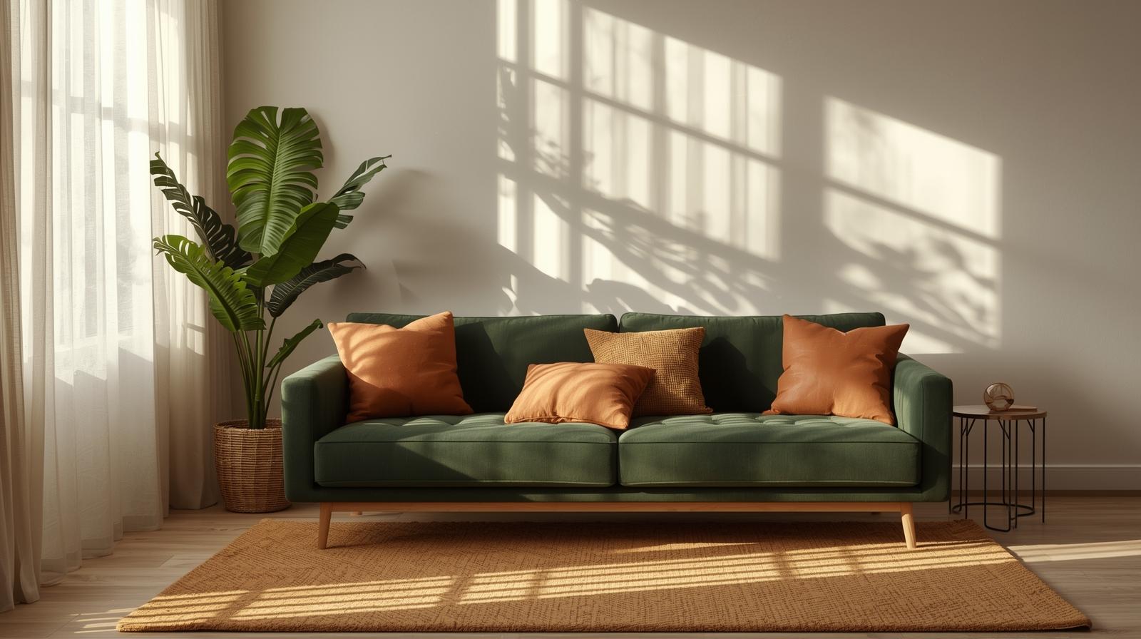
Perfection is exhausting. Warm minimalism embraces the slight irregularity—the weave that’s uneven, the plaster that shows the hand that applied it. These surfaces don’t reflect light; they drink it in.
Linen curtains hang with a soft slump, never taut. They wrinkle. They fade slowly in the sun. And that’s the point. Unbleached cotton throws feel like they’ve been washed a hundred times, even when they’re new. The frayed edge isn’t a flaw—it’s a record of use. Of life.
Walk into a room with limewash or clay plaster at 3 p.m., and you’ll see shadows pooling in the gentle undulations of the wall. No two square feet are identical. The surface breathes. Literally—many plasters regulate humidity. That’s function disguised as poetry.
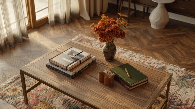
Machine-perfect finishes erase time. But warm minimalism invites time in. A wooden tabletop with a knot, a ceramic vase with a slight warp—they remind us that things are made by hands, not algorithms. And hands are imperfect. (Thankfully.)
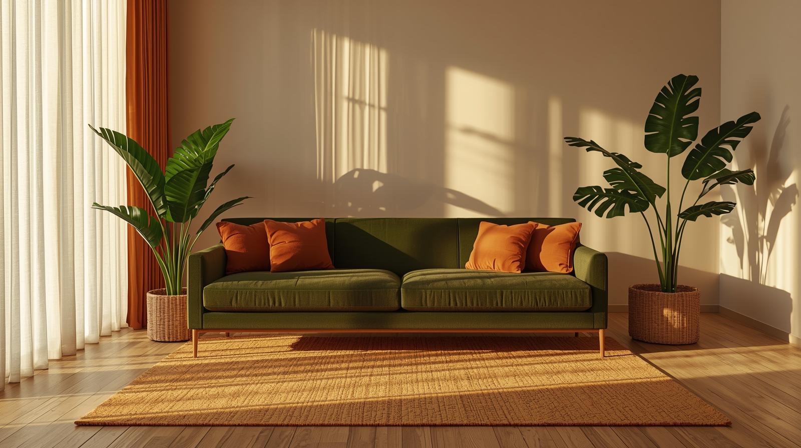
Forget modular sectionals that look like office furniture in disguise. The pieces defining 2025 are low, grounded, and shaped by nature’s logic—not CAD software.
Sofas sit closer to the floor, their arms curving like riverbanks. Chairs have backs that follow the spine, not the grid. There’s no sharp corner where a shoulder might catch. Everything flows. Everything rests.
Oak is back. Not stained espresso or bleached gray, but finished with oil that deepens its natural amber tones. You can see the grain swirl, the growth rings, the quiet story of the tree. Reclaimed walnut from old beams, bamboo milled with care, teak salvaged from decommissioned boats—all find their place. (For sourcing guidance, our sustainable-furniture-materials directory lists verified artisans and mills.)
Empty space isn’t wasted space. It’s the pause between notes. The breath between sentences.
A room with one chair, a low table, and a window doesn’t feel barren. It feels spacious—because your eye isn’t fighting for focus. Light travels unobstructed. Air circulates. You notice the dust motes dancing in a sunbeam. That’s luxury.
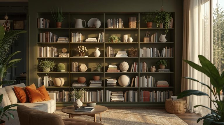
Furnish only 60% of what the room could hold. Leave 40% open.
This isn’t arbitrary. It’s a discipline. Too much furniture turns a room into a catalog spread. Too little—and you’ve got gallery vibes, which can feel cold. Sixty-forty strikes the balance: enough to live, not enough to clutter.
Remove one thing. Then another. Ask: does this object serve function or memory? If neither, it’s noise. Warm minimalism isn’t about austerity—it’s about clarity.
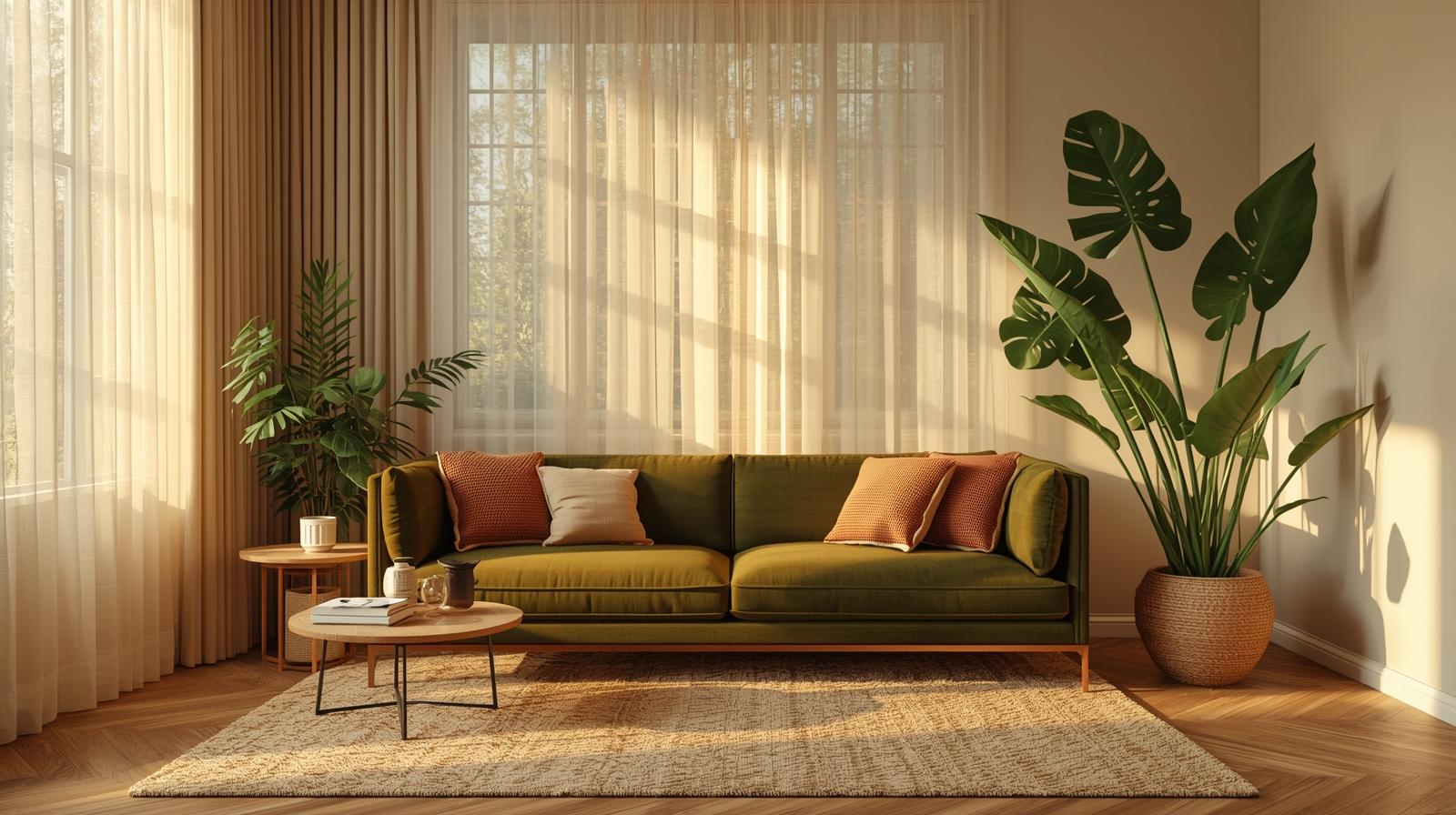
Japandi—the fusion of Japanese wabi-sabi and Scandinavian hygge—is no longer a niche. It’s the quiet consensus of 2025. Both traditions honor slowness, craft, and seasonal change.
Wabi-sabi finds beauty in transience: a cracked teacup repaired with gold, a wooden shelf that sags slightly under books. Hygge offers comfort: wool blankets, soft light, the ritual of tea at dusk. Together, they create interiors that are both meditative and livable.
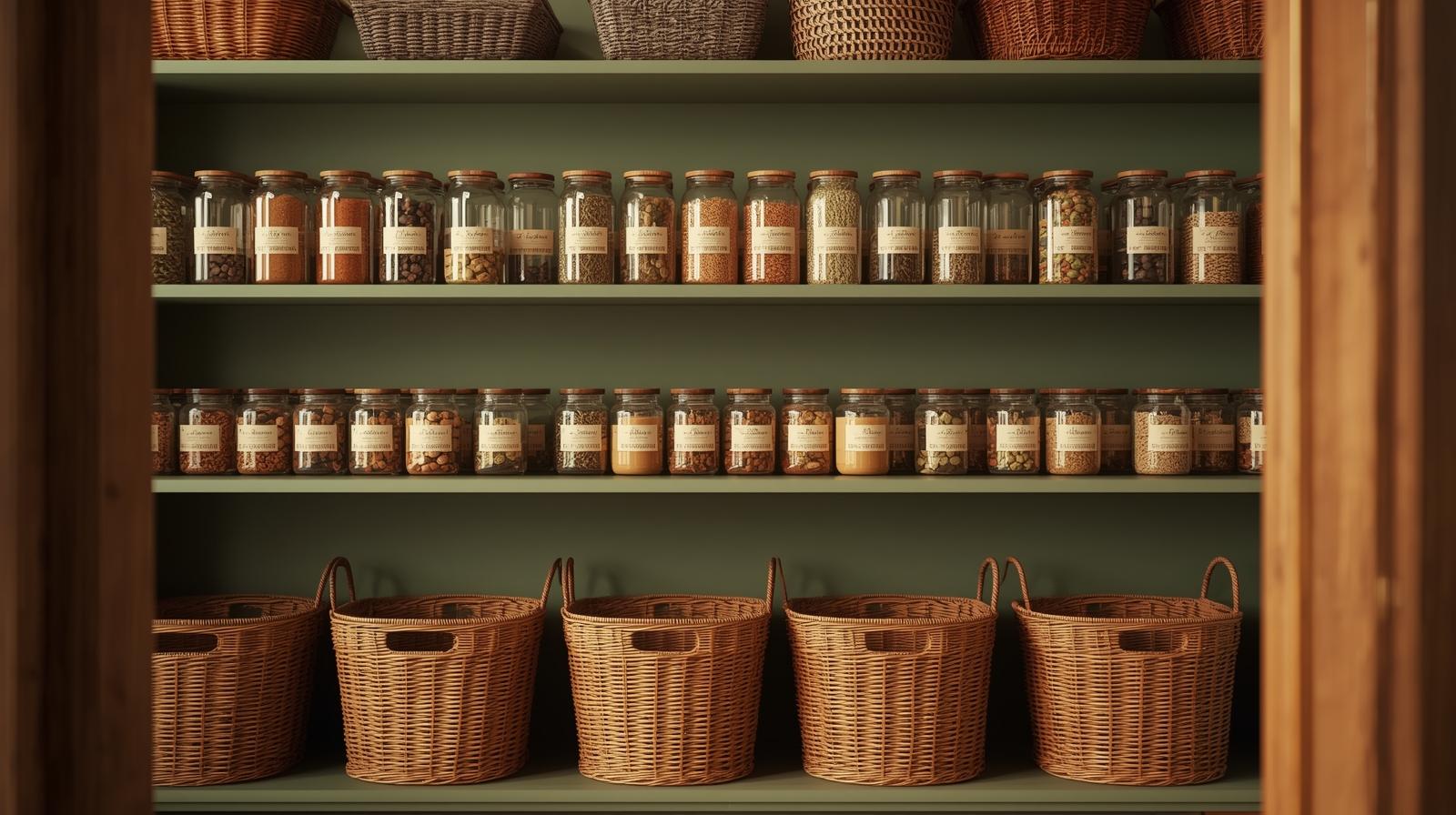
Neither culture treats a home as a showroom. Objects are chosen for use and meaning. A basket woven by hand. A ceramic bowl glazed with wood ash. Nothing is purely decorative. (New to this blend? Start with our japandi-style-guide—it walks through room-by-room applications without dogma.)
One color. Endless depth.
A room painted in “oat” might include a rug in “fossil,” a throw in “dune,” and a vase in “unfired clay.” All within the same family. All subtly distinct. The effect is calm but rich—like walking through a forest in early fog.
Instead of pairing navy with mustard, try nubby wool against smooth stone. Rough-hewn linen beside polished oak. The eye registers difference through touch, not hue.
Monochrome only fails when texture is ignored. Add a hand-knotted rug. A plaster wall. A chair upholstered in bouclé. Suddenly, the room hums with quiet complexity.
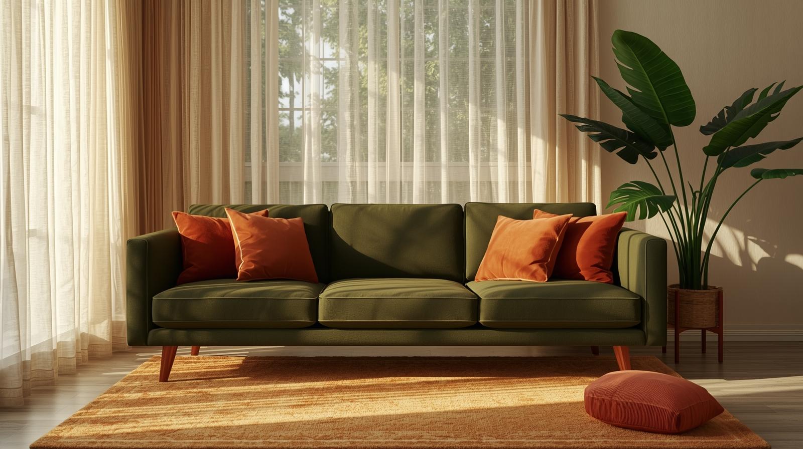
A single fiddle-leaf fig in the corner doesn’t count. Warm minimalism weaves the outside in—structurally, materially, sensorially.
Sliding glass walls disappear completely. Patios become extensions of the living room, paved in the same stone. You don’t just see the garden—you inhabit it.
Honed limestone or slate tiles run from the terrace into the kitchen. Rainwater might track in. Leaves might blow across the floor. That’s not mess—it’s connection.
No more wilting peonies in vases. Instead: bleached birch branches, dried pampas grass, seed pods arranged on a shallow tray. They require no water. They change with the light. They belong.
Lighting in warm minimalism isn’t about brightness. It’s about mood.
Bulbs are hidden. Light bounces off ceilings or filters through rice paper. Shadows pool in corners, softening edges. A room lit this way feels enveloping, not exposed.
Forget 4000K “daylight” LEDs. The standard now is 2700K—amber-hued, gentle, the color of candlelight or late afternoon sun. It flatters skin, wood, and plaster alike.
Most homes have one central fixture that bathes everything in flat, shadowless glare. Warm minimalism rejects that. Use floor lamps. Table lamps. Wall sconces. Layer light sources. And sometimes—just turn them all off. Sit in the dusk. Listen.
Warm minimalism in 2025 isn’t about what you remove—it’s about what you choose to keep. Each trend circles back to reverence: for material, for silence, for the way light falls across a quiet room at 4 p.m. This is design that breathes. And in a world cluttered with urgency, that breath may be the most radical gesture of all.