Newsletter Subscribe
Enter your email address below and subscribe to our newsletter
Enter your email address below and subscribe to our newsletter


Elevate Your Space, Everyday.
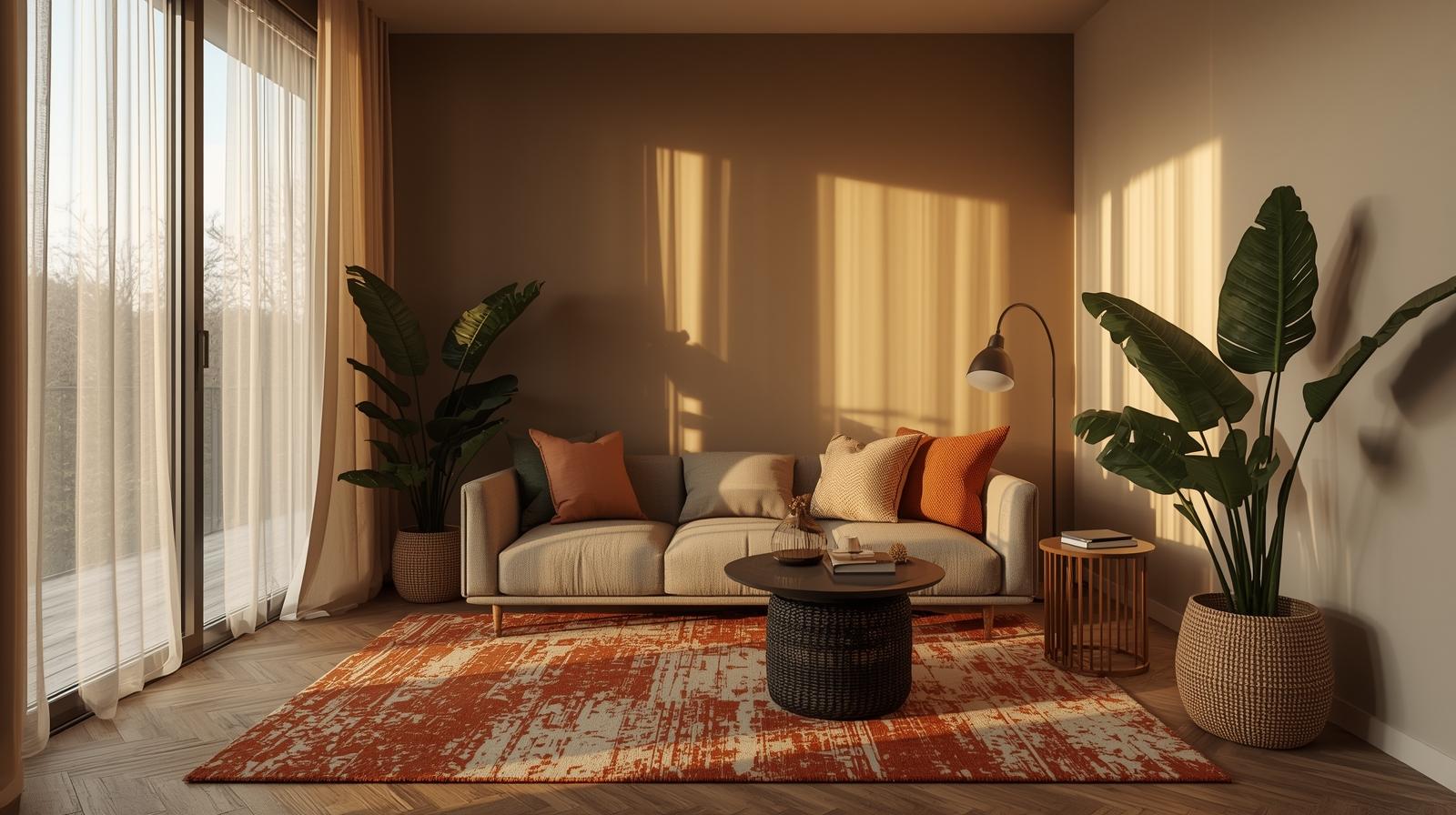
Struggling with a compact area? These small living room ideas will help you maximize space without sacrificing style.
True elegance in compact living isn’t about illusion—it’s about curation. A small living room thrives not on tricks, but on disciplined choices: furniture that serves, light that lifts, and negative space that speaks. Forget squeezing in more; instead, invite in clarity. Here, we explore how to shape intimacy without congestion—where style and function align in serene harmony.
Clutter doesn’t just occupy square inches. It steals silence. And in a small room, silence is the rarest luxury.
Minimalism often gets misread as austerity. What I advocate isn’t emptiness for its own sake—it’s editing with purpose. Every object should answer two questions: Does it serve? Does it belong? If it fails either, it doesn’t stay. (I once removed a perfectly lovely ceramic vase because it only existed to fill a shelf. The shelf looked better empty.) Precision isn’t cold. It’s considerate—of space, of light, of the people who move through it.
This isn’t a suggestion. It’s a covenant. Bring in a new cushion? Remove an old one. Buy a sleek floor lamp? Retire the table lamp gathering dust. Small rooms have no margin for accumulation. I keep a woven basket by the door—not for storage, but as a temporary holding pen for things I’m considering discarding. If it stays in there 48 hours, it leaves the apartment.
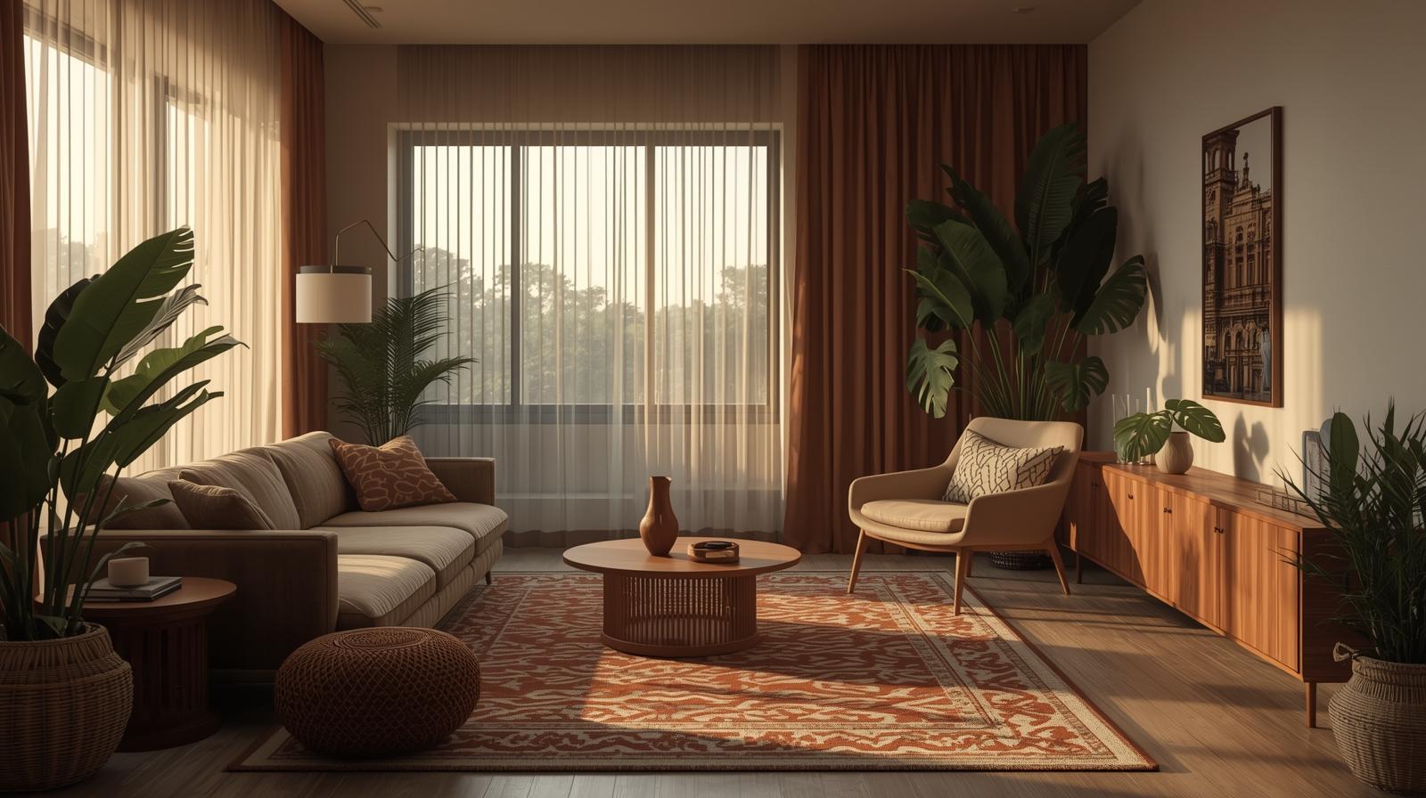
Storage in tight quarters must be invisible or open—but never both. Closed cabinets with solid fronts block light and feel like furniture barricades. Instead, opt for shallow, wall-mounted units with sliding linen panels or perforated metal doors. They hide the mess but let air—and light—pass through. Also, keep shelves narrow. Deep shelves invite hoarding. Shallow ones force honesty.
“If you can’t see daylight behind it, it’s probably crowding you.”
Furniture in a small room isn’t just functional. It’s spatial diplomacy. Every leg, every edge, negotiates with the air around it.
A sofa shouldn’t dominate. It should recede. Choose pieces under 32 inches high. Low backs and slim arms keep sightlines open, making the ceiling feel higher, the walls less close. I prefer sofas with exposed wood frames—walnut or bleached oak—because they read as structure, not mass. Plus, they catch the afternoon sun in a way upholstered boxes never do.
Legs matter more than fabric. A chair with solid sides turns into a visual wall. One with slender, tapered legs? It disappears beneath the eye’s path, letting light slip underneath and connect floor to wall. Even coffee tables should hover. Glass tops feel dated; instead, try matte-finish stone or pale ash on brass hairpin legs. The goal: make the floor feel continuous.
Deep-dive into smart solutions in our multifunctional-furniture-guide—from nesting ottomans to wall-mounted desks that vanish when not in use.
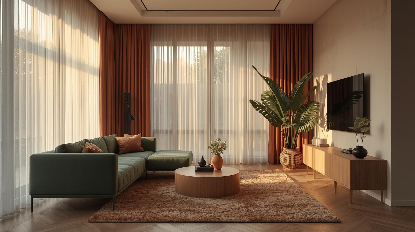
Light isn’t decoration. It’s the architect of mood and dimension. In small rooms, it’s your most generous collaborator—if you let it work.
Heavy velvet drapes belong in libraries and hotel lobbies. In a compact living room, they smother. Use a single layer of raw linen or undyed cotton. It diffuses harsh sun but never blocks it. The fabric should move with the breeze, casting soft, shifting shadows on oak floors. At night, it becomes a translucent veil—not a barrier.
Don’t place tall bookshelves perpendicular to windows. Don’t hang art above a sofa if it cuts off the upper third of the wall. And never—never—use dark roller blinds that seal out the sky. Even “blackout” should be a choice, not a default. Your room needs to breathe with the day’s rhythm.
Before you hang a single lamp, review these living-room-lighting-mistakes that shrink perception and mood.
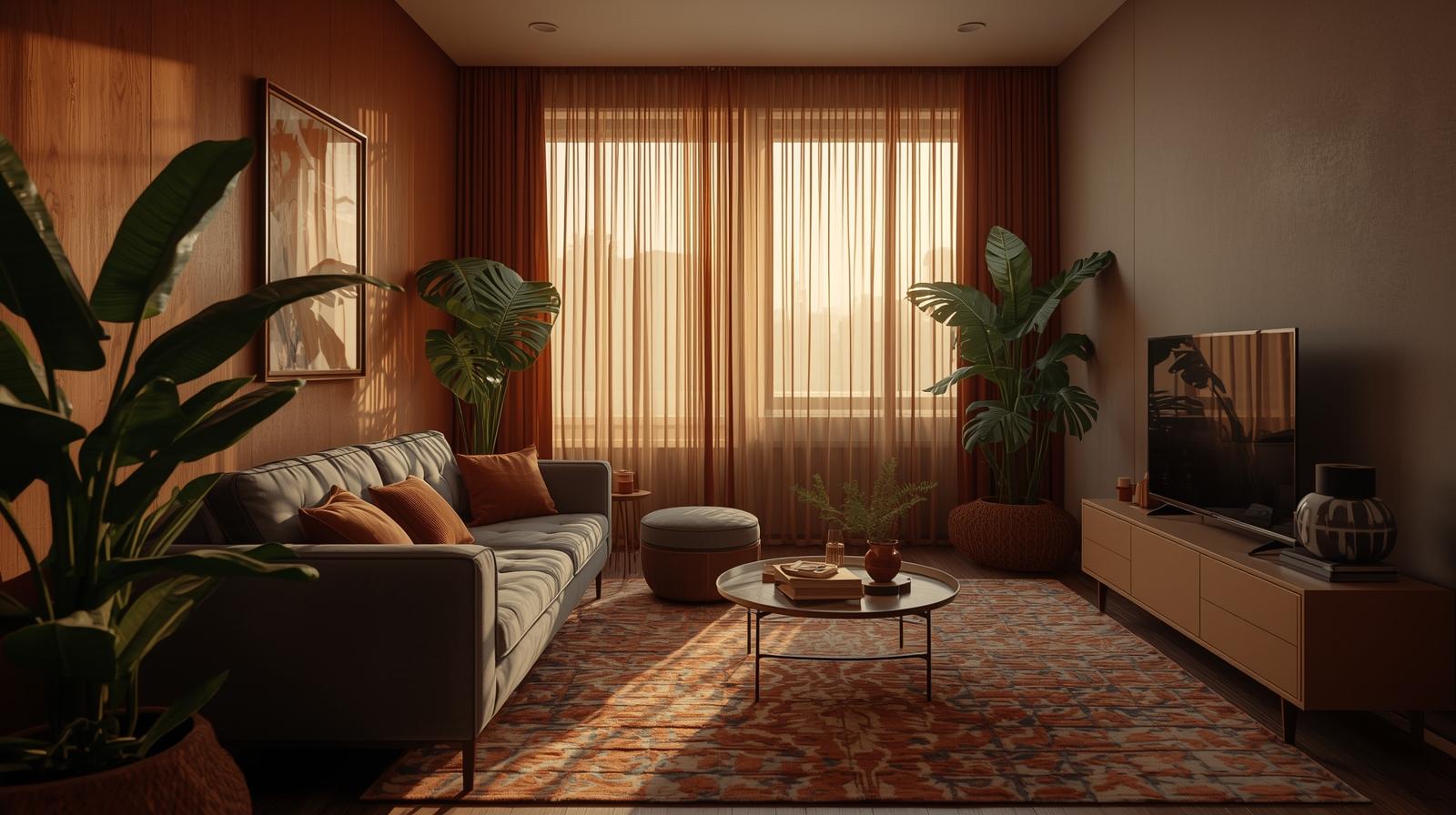
A mirror isn’t a trick. It’s a spatial negotiation. Done right, it doesn’t just reflect—it extends.
Hang a mirror directly opposite a window, and you double the light. But go further: angle it slightly to catch not just the window, but a potted olive tree or a corner shelf. Now you’re not just adding depth—you’re adding narrative. I once placed a tall, narrow mirror beside a doorway so it reflected the hallway beyond. Guests swore the living room was larger. It wasn’t. It just felt unbounded.
Frameless mirrors vanish. They become windows to elsewhere. Framed mirrors declare themselves as objects—which can be beautiful, but only if the frame is deliberate. A thin, blackened steel rim? Yes. An ornate gold number from a flea market? Only if it’s the room’s sole focal point. Otherwise, it competes.
For a masterclass in spatial expansion, see our detailed guide on mirrors-to-expand-space, where angle and scale transform tight corners into vistas.
Color isn’t the enemy of small rooms. Clashing tones are. A restrained palette—oat, bone, warm gray—creates calm. But without texture, it feels sterile.
Layering shades within one family—say, a beige sofa, a sand-colored rug, and ivory throw pillows—builds depth without division. The eye isn’t interrupted by contrast; it glides. And in a small room, uninterrupted sightlines equal perceived spaciousness.
Texture speaks where color shouts. A nubby wool blanket draped over a linen armchair. A rattan side table next to a smooth ceramic lamp. A brushed brass tray on a matte concrete console. These contrasts are felt, not seen from across the room. They invite touch, which grounds the space in humanity—not showroom perfection.
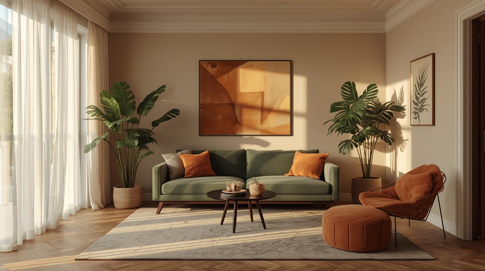
When you can’t expand outward, expand upward. Ceilings are underused real estate.
Use open shelving that stops 6 inches below the ceiling. Paint it the same color as the wall. Keep only essential items—three books, a single vase, a small framed photo. The vertical line pulls the gaze up, making the room feel taller. Avoid filling every shelf. Negative space between objects is part of the rhythm.
Hang artwork so its center aligns with your eye at standing height—but in a small room, nudge it slightly higher. Pair it with a slender wall sconce mounted above. The upward gesture tricks the mind into sensing volume. I use adjustable track lighting aimed at the ceiling. The bounce-back glow widens the space more than any floor lamp ever could.
In open-plan or studio layouts, zones must feel intentional—not accidental.
A rug isn’t just underfoot. It’s a declaration: “This is where we sit.” Choose one large enough that all seating legs rest on it. Then, hang a pendant directly above the coffee table. The light defines the zone as surely as a wall would. Keep adjacent rugs in the same tonal family—no jarring patterns or colors.
Push nothing against the walls. Pull the sofa 4 inches out. Float the armchair near the window but not touching it. This creates circulation paths, however narrow. It also makes the room feel dynamic—lived in, not staged. Plus, air moves. Dust doesn’t settle in corners you can’t reach.
Curation isn’t a one-time act. It’s maintenance. Like pruning a bonsai.
Before donating or discarding, remove the object completely for two full days. Don’t stash it in a closet—put it in your hallway or car. If you don’t miss it, it wasn’t serving you. If you do, ask why. Was it function? Sentiment? Or just habit? Only keep it if the answer is necessary.
Marie Kondo asked if things spark joy. I ask if they spark calm. A smooth river stone on a shelf. A single stem in a slender vase. A hand-thrown mug used every morning. These aren’t decorative. They’re anchors. In a small room, every object should steady you—not excite, not impress, but settle. Because intimacy isn’t created by stuff. It’s created by space left for breath, for thought, for silence.